


INSPIRED BY | MASTERS & MUSES | WORLD OF CABANA
For those who wish to see the very best of English design, David Hicks’ incomparable interiors are an excellent place to start, writes design consultant, critic and Editor-in-Chief of The London List, Benjamin Weaver.
BY BENJAMIN WEAVER | MASTERS & MUSES | MARCH 2023

David Hicks, born in 1929, was one of the few English decorators to sway the indigenous upper classes from their predilection for the Masterpiece Theatre school of design. While American designers, such as Frances Elkins and Billy Baldwin - and more recently, Stephen Sills and Billy Cotton - have consistently reinterpreted and revitalised traditional interiors, making them relevant to the era and epoch in which they live, in the UK - pre, and even post, Hicks - there has been a paucity of such originality, with an over-reliance on period pastiche.
The charismatic, possibly over-indulged, only son of a stockbroker, Hicks started his career, “painting cornflakes packets”, as he would later recall, in the art department of advertising agency, J Walter Thompson. Then, in 1954, a glowing article appeared in House & Garden magazine on the eye-popping makeover that Hicks, then in his 20s, had wrought on his mother’s Belgravia townhouse. There was almost overnight a whirlwind of excitement, whereupon the glittering beau monde of London high society — such as Mrs Douglas Fairbanks Jr and Mrs Rex Benson, ex-wife of publishing magnate, Condé Nast — began beating a path to the young designer's door.
“I’ve had Syrie Maugham and John Fowler; I want something new,” Benson told him in no uncertain terms. It was a request ideally suited to Hicks’ bold, graphic schemes, which, in large part, could be attributed to his quite reasonable aversion to what he called, “the mauve socks and suede shoes image” of the English decorator.
Handsome, charming and debonair, Hicks caught the eye of Lady Pamela Mountbatten, the younger daughter of Earl Mountbatten of Burma, the last Viceroy of India and a great-grandson of Queen Victoria. Upon their marriage in 1960, Hicks found his newfound celebrity, and ego, immeasurably enhanced. Of course, this went far beyond royal connections. To borrow a somewhat hackneyed phrase: behind every good man, there stands a great woman - and, as Lady Pamela would later recall, Hicks' signature high-gloss brown walls entered his decorative repertoire as a result of her hurling glasses of Coca-Cola at him during moments of marital discord.

© The Estate of David Hicks.

© The Estate of David Hicks.

© The Estate of David Hicks.

© The Estate of David Hicks.

© The Estate of David Hicks.
Hicks’ vibrant, color-saturated interiors became the acme of jet-set chic, and very soon Sultans, Kings, and even rock stars were queuing in their droves for his unique, somewhat idiosyncratic brand of savoir-faire. Even high priestess of refined WASP style, Jackie Kennedy, told Hicks that the only way she made it through her first night at the White House - which she referred to as “that morgue” - was by begging a pair of his bedside tables from her sister, the effortlessly elegant Lee Radziwill, to brighten up the otherwise oppressive presidential abode.
“I never sit in a chair, choose a fabric, admire or criticise my family’s clothes, without being intensely aware of what I'm looking at,” opined Hicks. “Dedication to design means ruthless criticism and losing friends.” Despite such strong, unyielding views, something sorely lacking in the rose-tinted echo chamber that is contemporary interior design, and a temperament that veered between disarming charm and apoplectic rage, Hicks was adored by friends, family and clients alike.
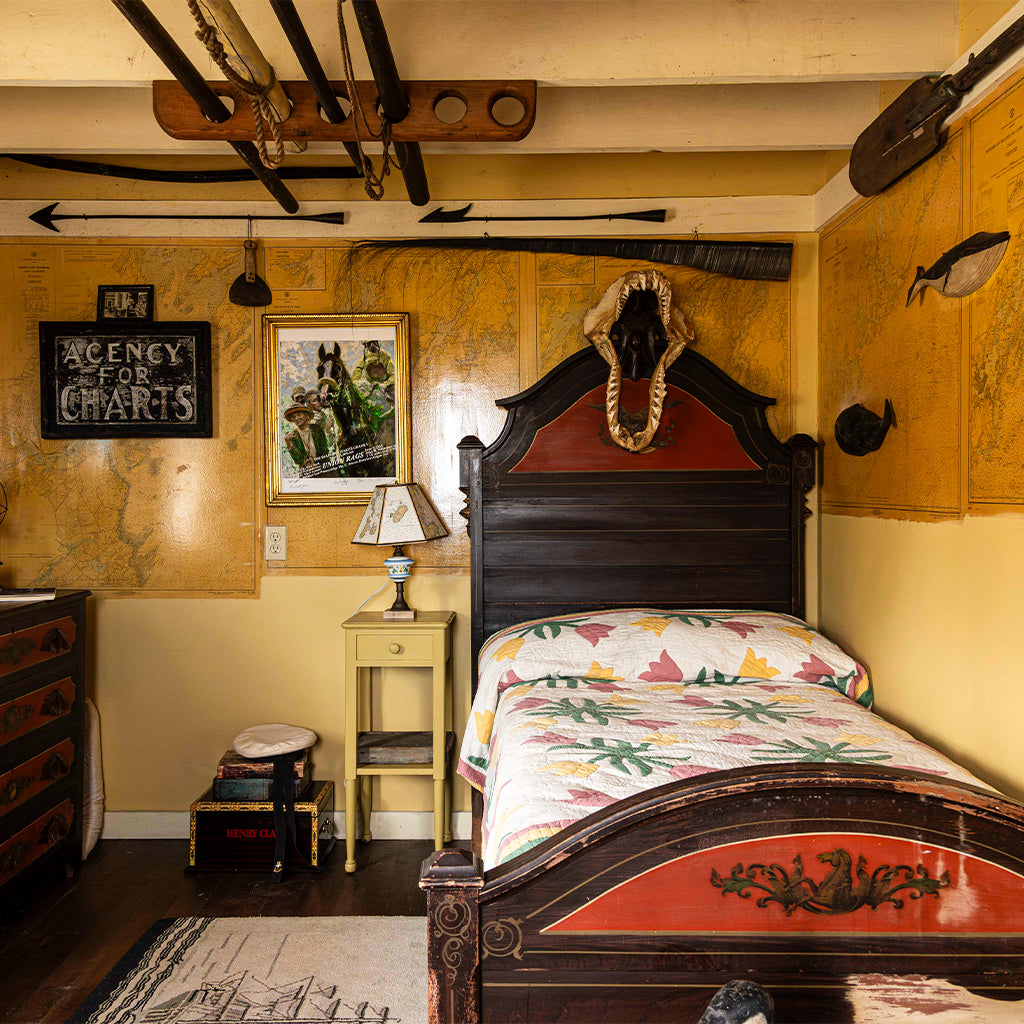
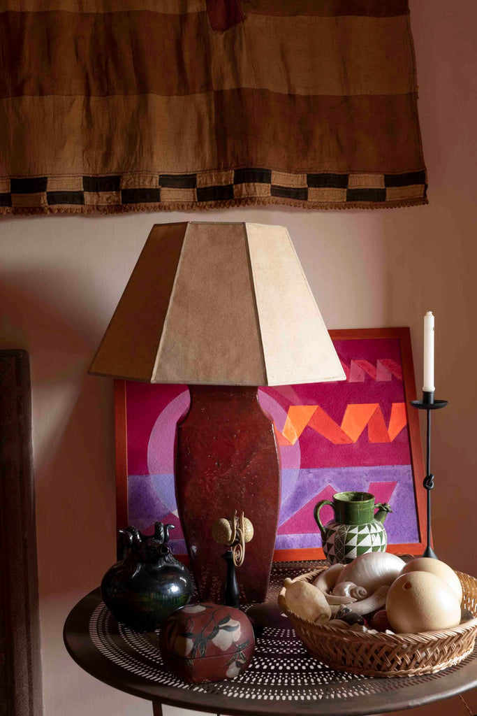
Hicks revolutionised country house style, eschewing safe, staid, good taste and in its place, introducing a cacophony of clashing colours, geometrically patterned carpets - which even infiltrated mainstream pop culture, with a scaled-up version of his hallmark hexagonal design paving the corridors of Stanley Kubrick’s Overlook Hotel in The Shining - and signature tablescapes, such as over-size objects arranged in small spaces, and compositions of curios and artworks in the vein of famed collector and patron of the arts Marie-Laure de Noailles.

A bold pink bathroom © David Hicks in Colour
“He killed every flower in his soul,” quipped Min Hogg, the famed founding editor of The World of Interiors magazine, in reference to Hicks' antipathy towards chintz and florals. “His was a rigorous, very tailored look. So much of it was about control. There wasn't a wrinkle or crease anywhere,” Hogg said.
Hicks was prolific, dominating the International design scene in the sixties and seventies, in part, due to the forthright nature of his character, whereby, if he found something ugly he would offer to redesign it himself; whether that be houses, hotels, restaurants, a yacht for King Fahd of Saudi Arabia, a nightclub on the QE2 — grey flannel walls edged in silver — and even, once, a hairstyle.
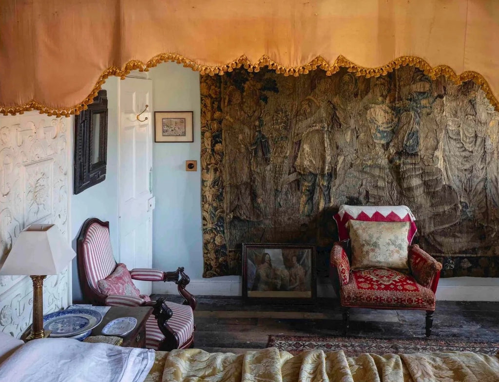
Despite his hatred of bland, uninspired design, underpinning Hicks' work was an inherent understanding of scale and proportion, as well as a predilection for symmetry and strong architectural elements, which served as a counterpoint to the more outré elements of his designs. In a similar vein to architect and decorator Isabelle Hebey, or French fashion designer Roger Vivier, Hicks championed eclecticism. After all this was, at the time, a relatively new, still shocking approach, combining such polarising elements as Chippendale and Louis XV furniture with chrome accents and abstract artwork, which, more often than not, looked at its best within a rigorous envelope of Georgian architecture.
Never afraid to set the cat among the pigeons, for the apartment of collector, philanthropist and cosmetics entrepreneur Helena Rubinstein, Hicks designed a somewhat unusual sitting room, where purple tweed walls served as a backdrop to a collection of Victorian furniture, painted white and upholstered in magenta leather.

All-white interior © David Hicks in Colour
To refer to Hicks only as an interior designer is, perhaps, to do him an enormous disservice, for in his later years it was architecture that interested him most. Following on from the success of one of his favourite projects, the Palladian-style Vila Verde, on the Portuguese coast - for which he chose the site, designed the architecture, garden furniture, and even the doorknobs - he turned his attention to the landscape architecture of his own house, The Grove, in Oxfordshire, whose geometrically precise gardens became the subject of numerous articles.
Even to the end, he was a stickler for detail, planning his own funeral, designing the coffin (to be filled with his obituary notices), as well as the sort of hearse to be used (an ivy-festooned trailer attached to his Range Rover), designating the dress code and even going so far as to edict which Royals should receive an invite.
In his modestly-titled treatise, David Hicks on Living with Taste (1968), the designer wrote, “My greatest contribution…has been to show people how to use bold colour mixtures, how to use patterned carpets, how to light rooms and how to mix old with new.” Hicks’ decorating schemes were pure theatre, bold, masculine, with no chintz and, in perhaps the greatest break with tradition, no hint of Fowler about them, having wholeheartedly rejected the English penchant for treating stately houses as mausoleums of safe, uninspired good taste.
David Hicks in Colour, the first title from Cabana publishing, couldn’t come at a better time. It will, hopefully, serve as inspiration for a bevvy of set-in-their-ways English decorators, still clinging on to the dark ages of country house style. For those who wish to see the very best of English design, David Hicks’ incomparable interiors are always an excellent place to start.
- - - - - - - - - -

DAVID HICKS IN COLOUR
David Hicks in Colour is available to purchase via the Cabana Bookshop
CABANA LOVES


Latest Articles